Case Study: How to implement UX design process and methodology for a systematic UI uplift
Background:
The Infor Design System is built to offer many product teams within the org with tools, guidelines, education, and support they need to successfully build products across the ecosystem. And a big part of the design system involves the UI which has a foundation that is made of colors, typography, icons, and other baseline definitions.
With an existing UI and component library that many teams with different tech stacks are already using, how do we then effectively enhance the entire UI even for legacy products that aren’t built with modern technology?
“My contribution is in conducting research, analyzing data, designing, validating designs, and documenting our design decisions as education and tools for all.”
The task and mission of the design system itself is indeed quiet complex and it’s an massive undertake. Thanks for our (small but incredibly intelligent) engineering team, we’re leveraging an open-source design token framework as an output for some of our design decisions and UI definitions so legacy products can finally have a sustainable path to receive the latest UI updates.
From a design perspective, my contribution is in conducting research, analyzing data, designing, validating designs, and documenting our design decisions as education and tools for all.
Pretty neat, huh? Let’s get into the details and talk about how UX techniques and methods were a part of the design process.
Project Scope:
With an existing UI and component library, we needed to uplift and elevate the current UI foundation in the design system to give our applications a modern look and feel. Design and development worked very closely to build the infrastructure it needed to successfully deliver changes across the ecosystem. We needed a design process to get the wheel rolling on such a big initiative that could make an impactful change across the entire org. The end goal for this project is to have new UI definitions available for our product teams to consume through the use of design tokens.
Process:
Every project requires a different UX process based on types, sizes, resources, and deadlines. The core of it, however, should always involve research, analysis, design, and validation, which could overlap, repeat, and cycle throughout the process. That was the strategy for this project and we could not have started it off without diving into research first to help educate us on where improvements had to be made.
Process – Research:
With the strategy in motion, I started with a UI survey to discover and understand from our product teams and customers their immediate feedback on our current UI. Then I dug deeper into the problem areas by auditing 14 different products to reveal the “bad” UI that was in front of our users everyday.
Having the gathered data in hand, I was better informed about UI pain points of where our UI fell short, and where high-impact UI changes were that many products can benefit from.
“The most “hard-hit” areas were type, icons, and colors which we expected. The survey had revealed that 90% of the interviewees gave consistent and strong feedback on color usage...”
Process – Analysis:
The insights from my research was profound and it had illustrated the path we needed to go. The most “hard-hit” areas were type, icons, and colors which we expected. The survey had revealed that 90% of the interviewees gave consistent and strong feedback on color usage and that our products “lack contrast”, “look washed out”, “everything is black and white”, and “very muddy”. Taking that feedback, we had decided as a team that uplifting the color palette would be our first priority, followed by uplifting the type hierarchy and the entire icon set. From the survey and audit, we also saw a lack of type variations, and icons were also an issue where many were meaningless, misused, and inconsistent in styles.
Now with a big basket of UI issues in our hands, we were ready to get to work.
Process – Design (and Validation):
Color Palette
With uplifting the color palette being our first priority, I needed to figure out how exactly it can be accomplished in conjunction with the infrastructure that our engineers were building. I established a process plan to keep myself on track and to make sure I’m looking at the task as holistically as I could be.
Process plan for color palette uplift:
1. Research on basic color theory principles and best practices
2. Research on how other design systems are handling colors
3. Analyze the current color palette framework – 8 hues, 10 variants, and the logic behind each variation
4. Research and audit colors that are currently being used in our components by digging into the codes and searching for color usage across all components
5. Design by leveraging colors from our new native mobile work as inspiration in building the new color palette
6. Validate and “stress test” the new color palette by applying it to our UI components for in-context reviews
1. Research on basic color theory principles
2. Research on how other design systems handle colors
3. Analyze the current color palette framework
One of the things that I picked up from researching other systems was the use of HSL color model (hue, saturation, lightness) in creating color palettes. The HSL model helps to determine how series of colors can be scaled systematically by changing the value of any one of the three variables and by controlling those increments precisely using percentages. In the analysis of the current palette, I discovered that the color “make-up” in each level across the hues are not consistent which was a surprising finding. Another thing that I learned from the HSL model was the calculation of the average saturation and lightness which could be helpful later on as a reference point.

3. Analysis the current color palette (using the HSL model)
4. Research and audit colors that are currently being used in our components
With the understanding of how the current colors sit on the HSL model, I also needed to know how much of the entire palette is used across our components. The results from this audit showed that many color values were not actually used in our components. This is an important finding because it gave us an idea of which UI components the new palette would impact, and it helped us to determine how aggressive we should be with uplifting the palette.
“The results from this audit showed that many color values were not actually used in our components. This is an important finding because it gave us an idea of which UI components the new palette would impact...”
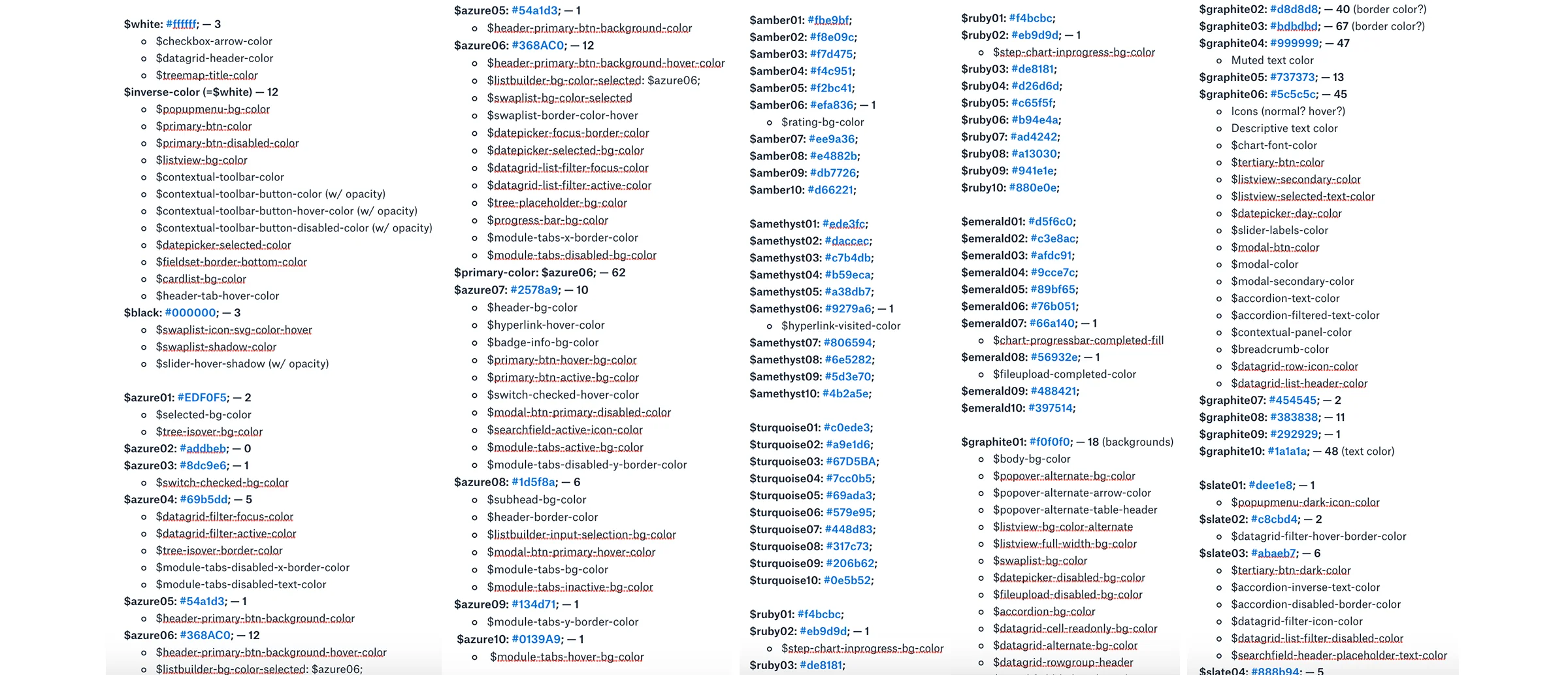
4. Research and audit colors that are currently being used in our components
5. Design by leveraging colors from our new native mobile work as inspiration
The native mobile apps that our team has been building have been getting very positive feedback from our users. And because of that reason and the long-term strategy to be using a single color palette for desktop and mobile applications, we wanted to leverage that success and funnel it into our design decisions for the color uplift. The colors used in our mobile apps are much more saturated creating lots of contrast, and that was in line with the direction we were interested in taking. By establishing the main color values, I moved on to build out the other variations deliberately using the HSL model while keeping the color usage on our UI components in mind.
5. Design by leveraging colors from our new native mobile work as inspiration
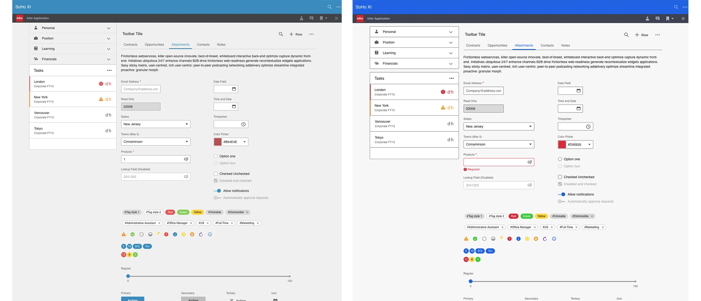
6. Validate and “stress test” the new color palette by applying it to our UI components
To get the new color palette moving forward, we needed to get a feel of how the new color values would look in our components in an real environment. We wanted to make sure we had addressed the complains we received from our users that the applications looked “dated”, “muddy”, and the lack of contrast made everything very “washed out” on the screen. The new color palette has a higher color contrast, that passes AA for accessibility standards, and it gives the applications a brighter look and a more welcoming and approachable feel.
Using our design tokens as an output, the new Uplift color palette is now available to our product teams to consume via our Github repo!
6. Validate and “stress test” the new color palette by applying it to our UI components
typography
Another area of which we wanted to tackle in the UI Uplift project was typography. Along with trying to establish a better type hierarchy to address what we discovered in our research, a new font family (Source Sans) was introduced as part of the new brand identity for the organization.
“We noticed that in the existing UI, there simply wasn’t enough variations to drive visual impact, which made our applications suffer from having any visual balance or focus.”
We noticed that in the existing UI, there simply wasn’t enough variations to drive visual impact, which made our applications suffer from having any visual balance or focus. Working with our engineers and our new design tokens infrastructure, we needed to create new definitions for font sizes, font weights, and line heights to allow product teams to easily consume and elevate their product UI.
Existing type hierarchy in applications
Type exploration on sizes and line heights (using an 8-pt grid)
I started to explore bigger type sizes while working with our 8-pt grid to determine the proper line heights. And just like with colors, “stress-testing” design assumptions in context with the application layout was very important as it could expose any shortcomings to further the design iteration process. In order to create a diverse group of type variations, adding additional font weights was also a strategic move to provide options for visual balance and focus wherever possible.
As we move forward with the new type hierarchy in the UI uplift project, it’s important to know that more validation on typography is still yet to be done to further refine and iterate our designs. And with our newly established design tokens, product teams now have a sustainable way to beta test new UI and help us gather more data to support and grow the design system – more user testings and design iterations to come!

Validate and “stress test” the new type hierarchy
Icons
So besides colors and type hierarchy, refreshing our icon set was another big focus in the UI uplift project. Based on the feedback we received from research and the new assets created for our native mobile work, we had taken a design direction to modernize our icons and streamline our icon library by organizing it to fulfill our needs for both desktop apps and mobile apps.
Our small team of designers started to collaborate, research, design, test, and iterate a batch of our mobile icons and a new design direction was then created. Our new icons are thinner in stroke, simpler in shape, and done with a soft curve to promo an approachable feel. The new icons had been validated thru our mobile designs and we needed to bring them into our desktop applications to make sure that they would work just as well.
Before and after samples of our icon set
Before and after samples of our icon set in our desktop application widget design
Once we had “stress-tested” the new icons with multiple of our desktop designs, we then had to figure out how to effectively cascade this change to our current icon set. I worked very closely with our engineers to make sure that the new icons can be backwards compatible so product teams can easily consume them without leaving our legacy products behind (just like with our new colors and type styles). What it meant, however, was the decision to re-create 400+ icons, with the strategy to slowly depreciate meaningless icons through development versioning. Working with a junior designer on the team, I oversaw the icon recreation process and offered guidance in systematic thinking. We needed consistency and the new icons needed to be well-thought-out, universal, and meaningful that could scale across platforms.
“I made sure we were properly documenting our design decisions into usage guidelines. From how much radius an icon needed to how to categorize an icon in our Sketch file, every little thing mattered to make sure that we were designing to scale.”
With the new design direction, I made sure we were properly documenting our design decisions into usage guidelines. From how much radius an icon needed to how to categorize an icon in our Sketch file, every little thing mattered to make sure that we were designing to scale. I had written guidelines on our Github repo and contributed in creating our icon Sketch files as tools for our designers (and non-designers).
Documenting design guidelines in Github
Documenting design guidelines inside the Sketch file
Outcome:
The entire UI uplift initiative took a course of several months to complete and it was truly a collaborative effort between a small team of engineers and designers. It was also a milestone that the design system needed to showcase the impact that our work can bring to our whole company across the globe. With UX process and methodology as our backbone, we researched, analyzed, designed, and validated our design decisions across platforms. What the design system brings is continuous evolution that sets the path for scalable design in product development.
Is your product team also building an open-source design system? What kind of challenges are you facing?